Overview
Using a smartphone while driving is dangerous. But driving late at night - in the middle of an unfamiliar area with your gas gauge on empty - how can you quickly and safely find an open gas station, a clean restroom, or the nearest ER?
Scope and Duration
Individual two-week project: Week 1 for interviews, problem definition, analysis and research, hypothesis, ideation, speed dating, and paper sketches. Week 2 for refining, wireframing, prototyping, usability testing, visual design and branding.
Tools and Methods
- User interviews
- Competitive and comparative analysis
- Storyboarding
- Speed Dating
- User flow
- Ideation and Sketches
It was a dark and stormy night…
My colleague Susan drives Bay Area freeways frequently, and quite often finds herself in need of gas or a restroom. It’s usually late at night, in unfamiliar neighborhoods, sometimes difficult to reach a friend, or unsafe to pull over to find directions. At the initial interview Susan asked for an app that she could consult quickly and safely while driving.
There are many “near-me” apps in the iOS App Store, but they do not provide curated, quick to choose options. My idea was to develop an app that would require no more than two or three clicks to find useful information while driving. It’s against the law to use a wireless phone for talking and listening, but it’s perfectly legal to safely and quickly check your smartphone map or navigation app while driving — the California Highway Patrol is training officers not to ticket these drivers.
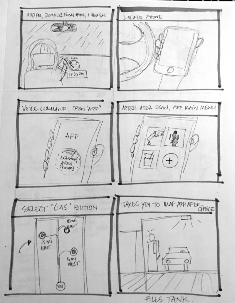
A scenario of the user's problem and a hypothetical outcome if using the Bernie app.
My hypothesis was that in order to prevent distractions, the interface should be very simple, featuring large buttons that could be recognized and clicked easily while driving. A couple of popular children games were my initial inspiration: Simon has a only four buttons for playing back a sequence of sounds, while Set requires you to quickly identify and recall sets of cards.
A big helper named Bernie
A St. Bernard dog was the perfect metaphor for the app itself and its name: a quick aid for someone in trouble. The app isn’t meant to be a comprehensive location finder app like the many already on the market — but to provide useful information to solve the user’s immediateproblem.
The name Bernie, a nickname for Bernard, borrows from a dog’s name the sense of familiarity and trust while lending the idea of simplicity and ease of use — “just go fetch it for me, Bernie!” This same feeling of trust and confidence would also be used for the app icon.
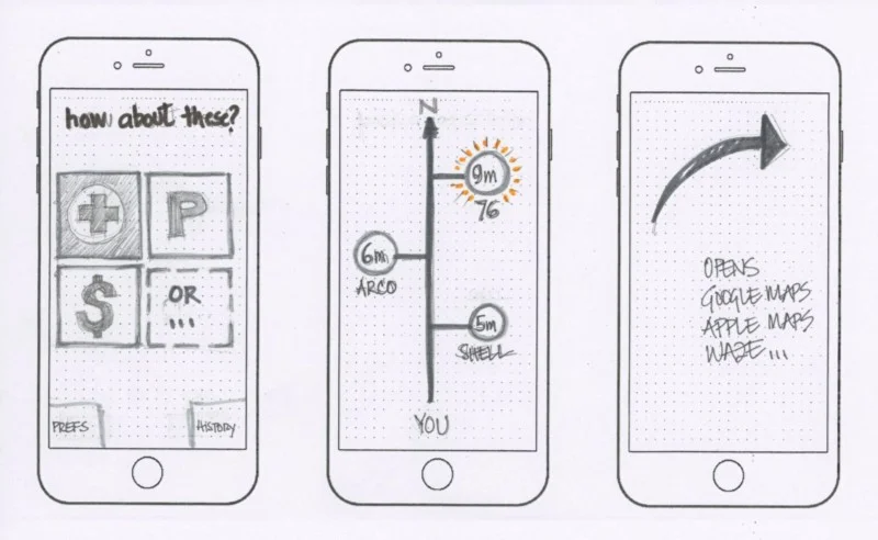
The Bernie app consists of a main screen with 3 category buttons, and a fourth button to choose more categories if desired. When the user clicks on a category button the app returns the three best closest locations. Over time, Bernie learns the most searched categories for quicker access. The user selects one of the locations and Bernie hands it off to the user’s favorite navigation app (Google Maps, Apple Maps, Waze, etc.) which then provides directions to the user.
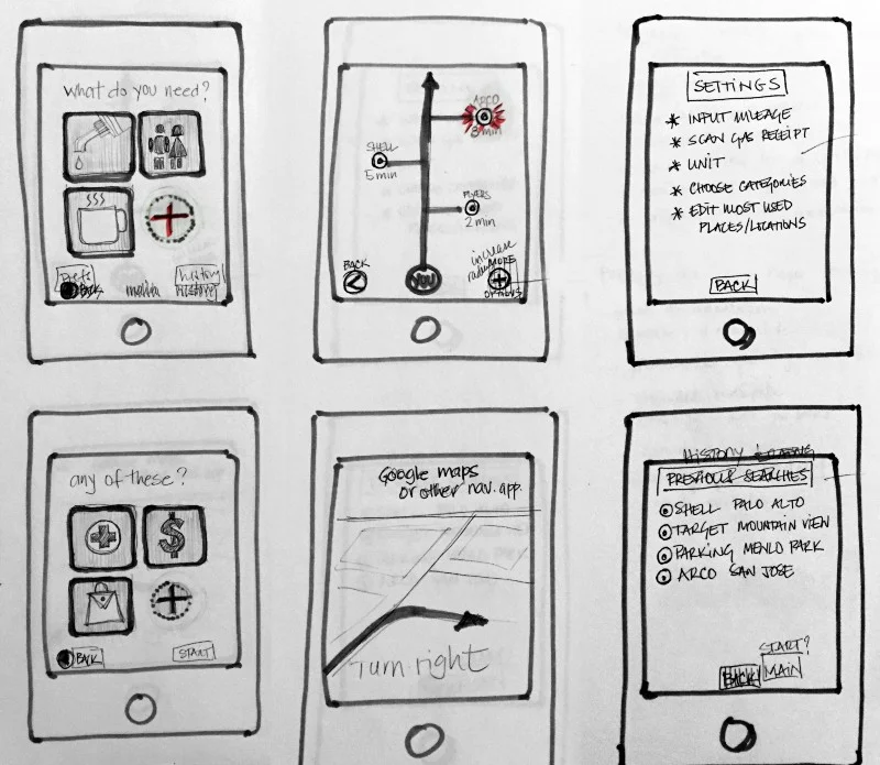
In this iteration more details were added after feedback from a speed dating session.
Usability feedback at a speed dating session was great, and uncovered a few details that were addressed accordingly, such as using larger icons on the map. Testers suggested features as well: a way to rate visited locations, set one’s own priorities for the results (distance, price, brands) were the most helpful and will be added to the next iteration.
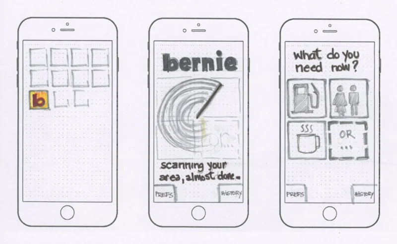
Left, the iPhone screen with Bernie’s simple, bright icon. Center, Bernie’s landing page, with a radar beam scanning the area around the use. On the right is the main screen, with the three most used categories buttons.
Left: a second round of categories is shown when the user presses the “plus” button. Center: a simple map lists the three best and closest locations for the user, showing their name and distance in miles or minutes. Right: user is warned they will be taken to their navigation app, which can be defined in the preferences.
Final thoughts and improvements
Bernie got high marks from Susan, the initial user, and I plan to develop a high-fi prototype in Invision for further testing with more users.
The most important element I took away from this process is that we must focus on defining the problem. And getting as much feedback and testing as possible during a project is the best way to evaluate whether we’re converging on an effective design solution. Usability testing is the critical reality check we cannot dispense with.
